
Casey.
Hackathon Project | Weekend project | 2017
Applying for jobs, especially for junior level, presents unique challenges. Going through the stressful and tedious process is not only hard for candidates to find the opportunity to relate to what they really want to do, also block the talented people from the companies.
We want to optimize the process of sourcing the opportunity, relieve the stress for candidates and eventually speed up the recruiting process.
Tool Used: Sketch, Illustrator, Invision, After Effects, Photoshop, Zeplin, Pen and paper, Human brain
My Role: I was a part of a small team with 3 people and was responsible for the experience strategy and visual design. I worked alongside with Yi-ting, another interaction designer, the whole time during the research process and usability testing.
Challenge.
More specifically, how might we optimize the process of sourcing the opportunity for junior-level candidates?
Current Experience.
Redundant and Confusing

We decided to focus on the Sourcing part.
First, we tried to identify what exactly is the problem with the current experience. By experiencing the current application process, we found that the most time-consuming parts are looking at the long wordy job description to decide which one to apply and the application itself.
Is there something wrong with current job descriptions?
Do different jobs have different pain point?
We would like to validate our thoughts through secondary research as well as the user interviews
Secondary Research.

The survey were done by the ladder
I found an interesting research about how applicants read job descriptions. Job-seekers were tracked using eye tracking technology that records where and for how long their eyes landed on a page, it turned out they spent an average of 49.7 seconds before dismissing a position as a poor fit, and 76.7 seconds with job ads that appeared to match their interests and skills.
The heat map shows a typical "F".
Insight: Job-seekers tend to spend less time on the real contents of job descriptions, which may increase their chance of being "not-matched".
Facts about Job Hunters
The internet has made it very easy for people to search out and apply to many job opportunities. However, sending out more applications doesn’t increase your chances of getting hired.
Insitght: Applying for jobs you’re unqualified for can hurt your chances at future positions with the company too.

2% of applicants actually get interviews, If resume doesn’t match

43% of irrelevant applicants were “blacklisted” by the companies
Understand Our User.
Design for A Specific Segmentation: Junior Professionals
Most people in the world need to look for jobs, there are millions and billions of applicants. We catalog them by experience level and specifically target junior level professionals who mostly just get out of college since it is hardest to start a new career.
Why focusing on one segment? Knowing that different segments have different sourcing preferences and behaviors, designing for all of them at once might lead us to not solving any of their problems very solid. And why the Junior? With more competition for the limited number of jobs available on the market and no experience, it is getting harder and harder for them to get jobs. Moreover, due to lack of networking and information, they need to search and apply online more than any other level professionals. It gives us more opportunities to contribute to their particular pain points.

User Interviews and Analysis.
To get more insights on candidates' behaviors and goals, we interviewed several junior level professionals from different fields as well as some hiring manager as recruiters individually. We would like to know how people from different fields look for jobs.
Questions we asked include job application processes, tools, feelings about the job application, what affects their decisions.
We interviewed with 6 job-seekers and 2 hiring managers.
Job Application Journey

We Mapped out the users' emotions, which was key to setting their expectations about the aspirational emotional state we were aiming to design for.
Purple means the emotion changes during each activity: the darker the happier
Conclusion: Most emotional changes happen at the points where they decide either to apply or not to pursue a job.
Interview details
I organized all the information we collected and made sense of it by coding all the answers, and extracted the problems from them; drew out the insights from the problems.

01
02
03
04
Findings
They want to understand what the company do
It takes time for them to read the job description, especially with a long standing one.
They would like to match their skills with the one listed in the job description
They want to track the jobs they applied
Takeaways
Present company info once they open the job description
Highlight the key points in the job description
Compare candidates' own resume and the skills on the job description
Save the job they are interested in and offer comparison with similar jobs
Design Goal & Criteria
1. The design will provide the candidates enough information for them to decide whether or not to apply for the job.
2. The design will consider the specific needs of different candidates.
3. The design will comfort the candidates' stressful feelings.
4. The design will help the candidates to organize and track their application process
5. Candidates can use our design across all the platform
System Map.

With a clear understanding of the requirement, I synthesized the insights and came up with all the features. We believe a chrome extension is a perfect tool in order to fulfill candidates' needs. The characteristics of extension - "it can be used across all the different websites" and its easiness to use with one simple click.
Wireframing and Validates
I generated stacks of ideas about the arrangement of UI, functional and data elements, and interactive behaviors. For our first prototype we want to mainly test out our idea. "Does the extension work?"
We used Invision to test with a few candidates and it works perfectly because it is very easy to understand.

Onboarding B
Onboarding A
Scan process
Ver. 1 Prototype

1. More visually demonstrate the rate
2. what does "save" means
1. No need to collapse
2. what should stay on the top?
1. Think about the order,
2. what should show the first?
3. What else does the candidate want to know?
1. Where it goes
2. Some requirement the users don’t care
3. Description misleading, some users don’t know what these step means
1. Hard to read and understand
2. Some requirement the users don’t care
3. Description misleading, some users don’t know what this step means
Ver. 2 Prototype

1. reorganize the layout of job position info
2. Add company info
Need to move to other folder as well
1. Added avg. salary (pulled from Glassdoor open source API)
2. Job Responsibility (natural language machine learning)
3. Team Name (natural language machine learning)
Modification
Job position
Time application time
The time that the candidates need to spend to fill the application form is really important. Some people ditch the whole application because it is too long, even though they are already halfway through.
We decide to use Quick Macros to go through the whole application process very quick and calculate the time for the candidates
Branding.

Character.


For the character Casey, we decide to go with the case image and make it cute. Finding job opportunities is hard enough. Finding a job you love is even harder. We want to use a cute character to comfort candidates' feeling.
User Interface Design.
UI: Xinbei Hu, Illustration: Yi-ting Chien and Xinbei
The Design contains three parts, onboarding, scanning page and the dashboard page.


Onboarding Process
When the user first clicks the extension, Casey will take the user to go through the very short onboarding web page. With the enlightening illustration explaining how the extension work, the user need to choose the personalization options in order for Casey to find the perfect match score customized for the user.
The last page gives a brief introduction on how to use the extension and how to use the job board to minimize learning.
The User also can upload another resume from here.


Your Job Matching Assistant
Casey is a chrome extension that will tell the user how well they match to a job description in order to help the user quickly make a decision and what they can do to improve the likelihood that they'll get a call back by the tips.
The order of the information is based on what affects their decisions the most and users' behavior of reading.
We plan to use Natural Language Processing (NLP) technology to parse descriptive and interpretative content to match soft skills. We calculate the overall matched skills versus missing skills to get the final match rate percentage. The front-end modules use Glassdoor API to fetch information about companies and salaries etc.
Introduce Casey.


Score matching
For each different score match, we designed a different Casey look.
Job Board
The “Job Board” webpage built with WordPress displays user profile, job application history, saved jobs and gives user statistical analysis to help them organize, keep track and make plans.
The users may drag their saved job to the folder on the left side menu to organize their application process.
The default setting of folders on the menu is "Saved", "Applied" and "Archive". The user may use "add" button to add more folders

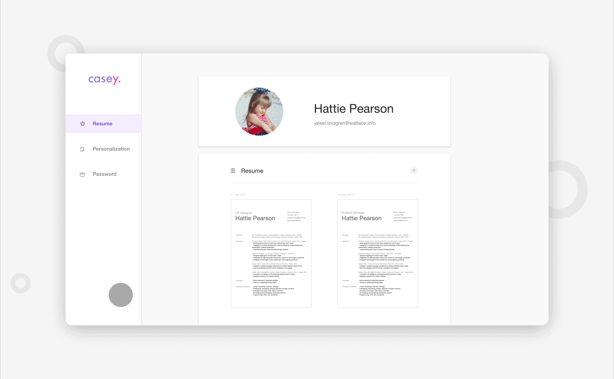
The user can also go to setting by click "setting" on the left corner to edit their resumes, preference or password.
In resume page, the users are allowed to upload multiple resumes to fulfill their needs
By mouse-covering Casey logo, the users can see it is a "go-back" button to the main page.
Takeaways.
Our extension leverages principles of emotional design to inspire users to go for a ride. With concerns about candidates' stress
What users say doesn't equal to what they mean.
There is a lot more information than what we collected from interviews, especially related to what affects their will to apply,
Even though this project doesn't contain a lot of screens, we still spend plenty of time on trying to figure out what content we should provide for the users.
Next Step.
Currently, with the help of Sean Echevarria from Jet.com and Def Method, the TX team was able to bring to life this concept and we hope that you take advantage in its power.
Check out the website and get early access!